iWatch Launch Video
Challenge
An ambitious plan to be the first banking app in Italy to launch an iWatch app was mustered at Deutsche Bank Italy - ‘La Mia Banca’ team. As an add-on to the banking app, iWatch use cases were intended to be an unobtrusive experience to the existing users.
Disclaimer: To comply with my non-disclosure agreement, I have omitted and obfuscated confidential information in this case study. All information in this case study is my own and does not necessarily reflect the views of Deutsche Bank
High level goals:
- To access the core functionality Global Position (consolidated) view of a user, without a need to open their mobile app
- Ability to check recent transactions made on debit/credit as notifications
- Facility to reach the nearest bank or ATM using apple watch
My Role
While working as UX and Interaction design for Deutsche Bank’s mobile banking app, got opportunity to lead the iWatch app design. Working as lone hands-on UX designer in concept refinement phase with client and responsible to liaise with project manager & dev team during design-to-dev handoff. Following a tight deadline, design deliverables from sketches/wireframes to final design was completed in 4 weeks.
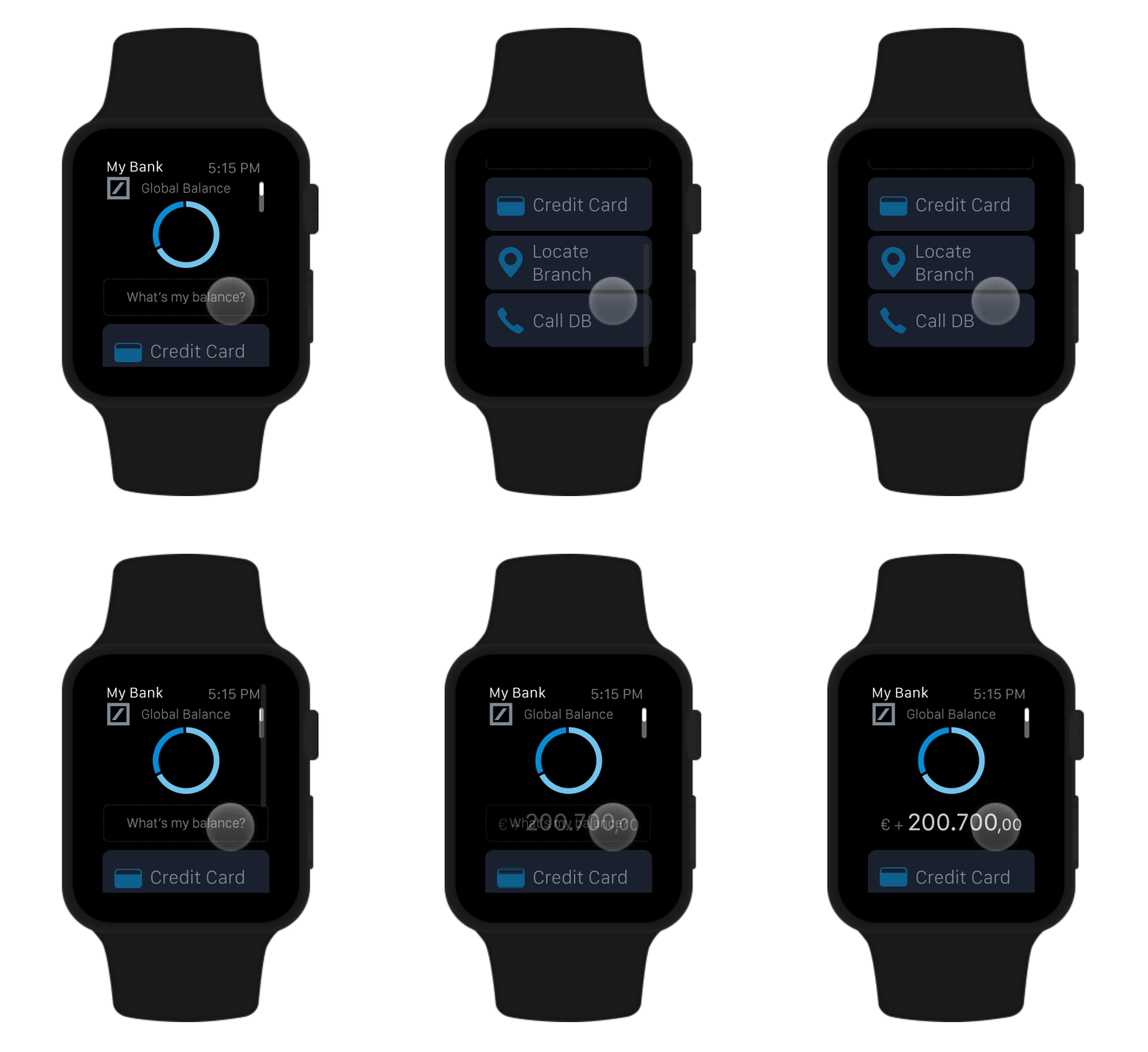
USE CASE 1
Design Process
On review of existing user data, hinted banking apps are generally used during the morning while people are on the move. Mobile app was considerably secure while checking personal balances and global position compared to involuntarily displaying account balance as figure on every hand raise act wearing an iWatch app.
After a lot of discussion, proposed the feature of quick view balance check. Gets to default ‘what’s my balance’ state at 3 sec interval.

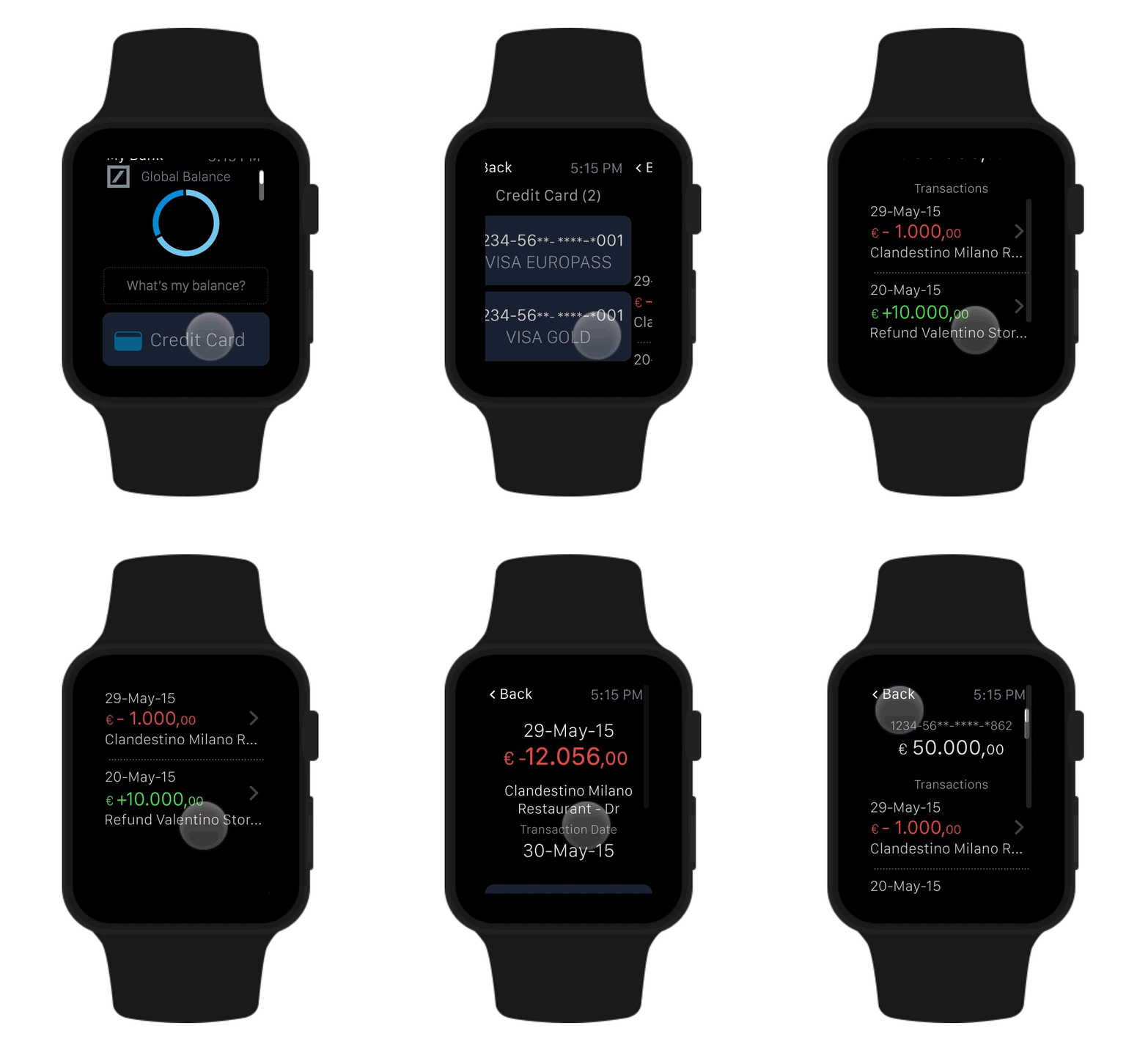
USE CASE 2
Hierarchical Navigation
Human interface guidelines from Apple in 2015 had best practices examples and design guidelines for the new device. For this transaction based app, my recommendation was to go with a hierarchical navigation structure with no deeper than 2 sub-levels.

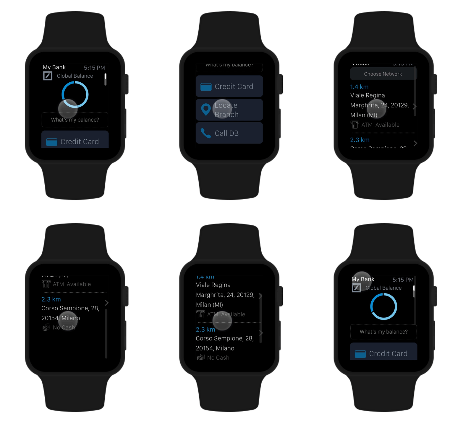
USE CASE 3
Locate nearest branch
One of the key feature to harness iWatch’s potential was the location services. Finding the nearest branch found its way to an important use case.

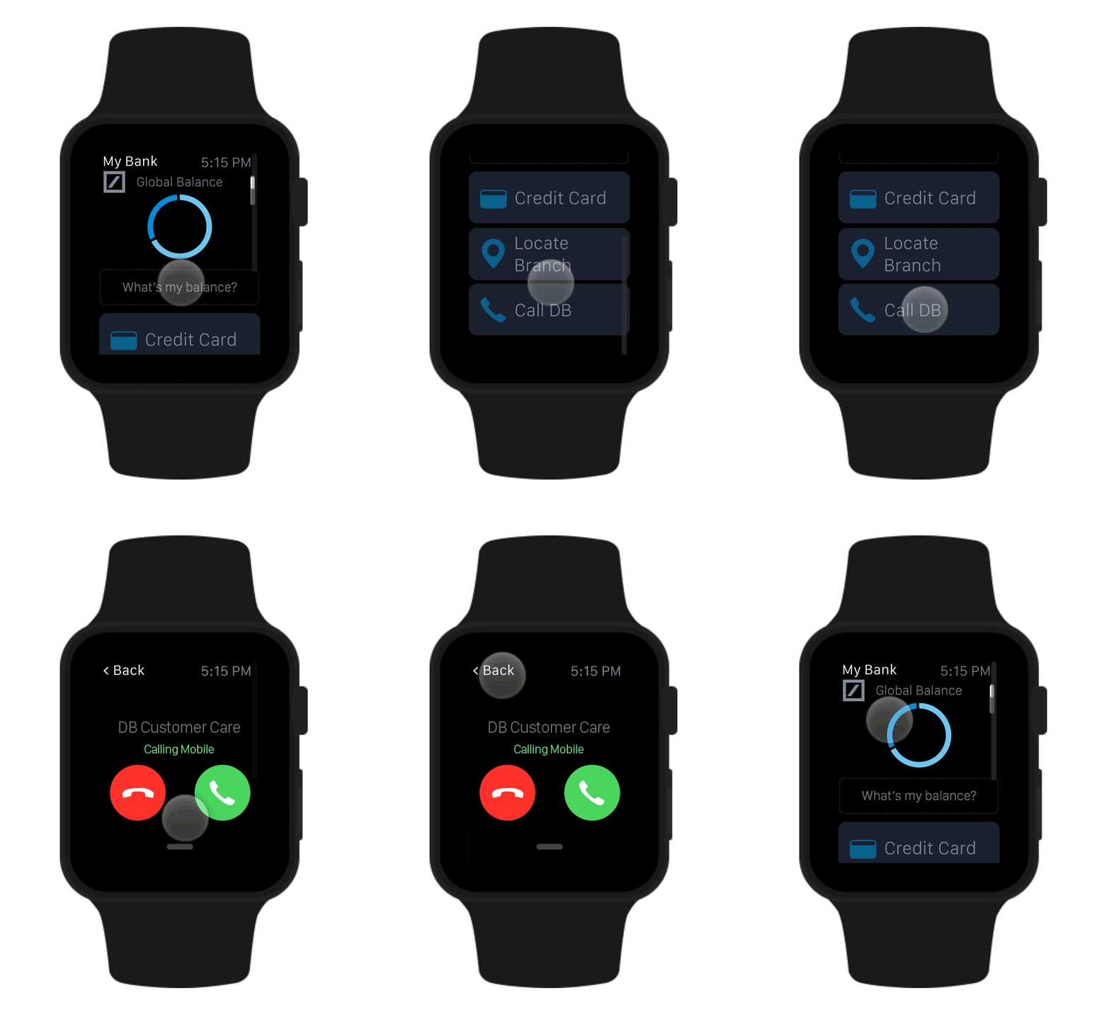
USE CASE 4
Call Customer Care
Additionally user can initiate customer care help call from their apple iWatch. The customer care number based on location is updated to default regional customer call center.

Other Conceptual Features
Proof of concept work for a design proposal on further enhancements in iWatch app but never made it to the go-live feature’s list.