Introduction
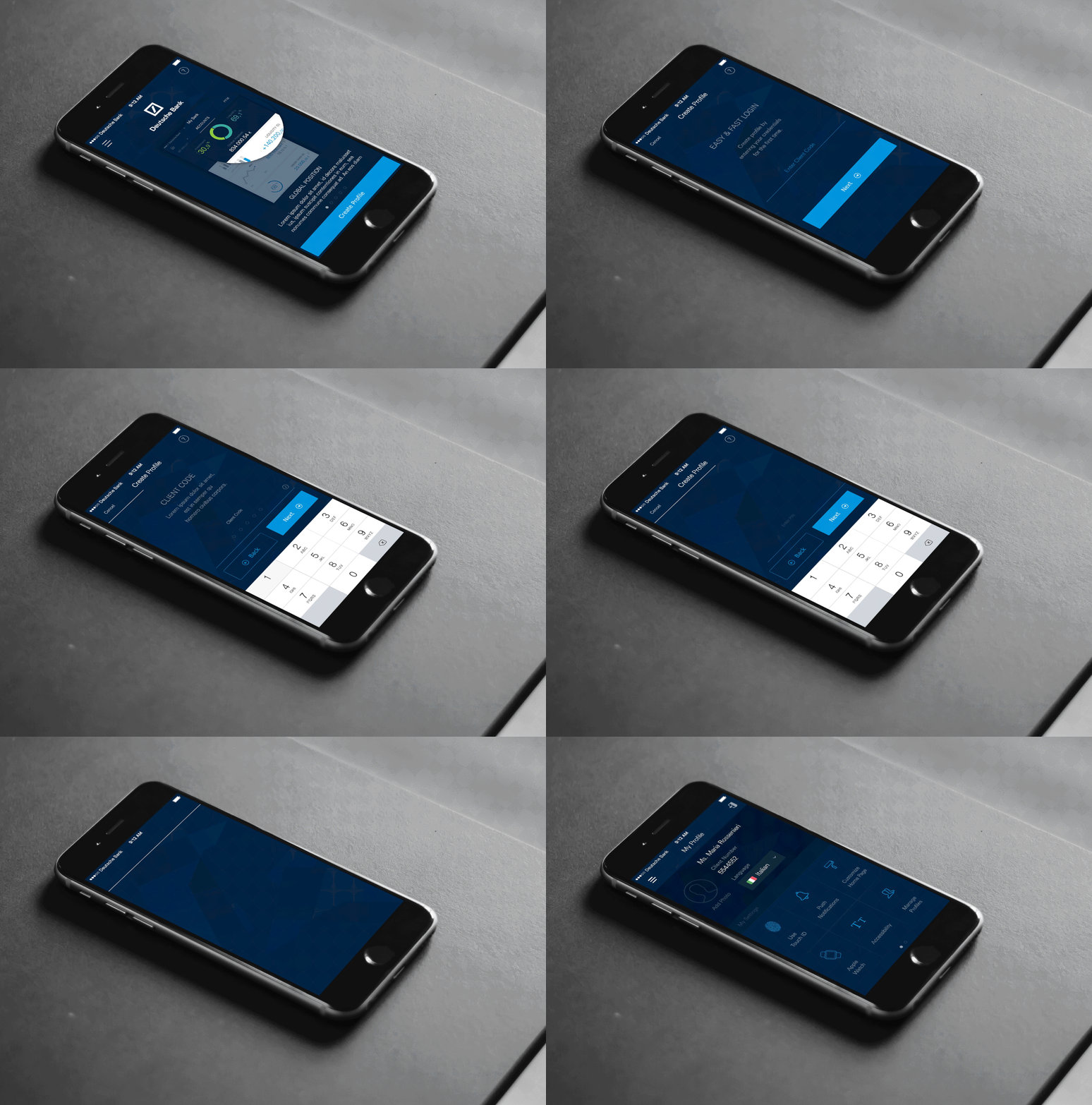
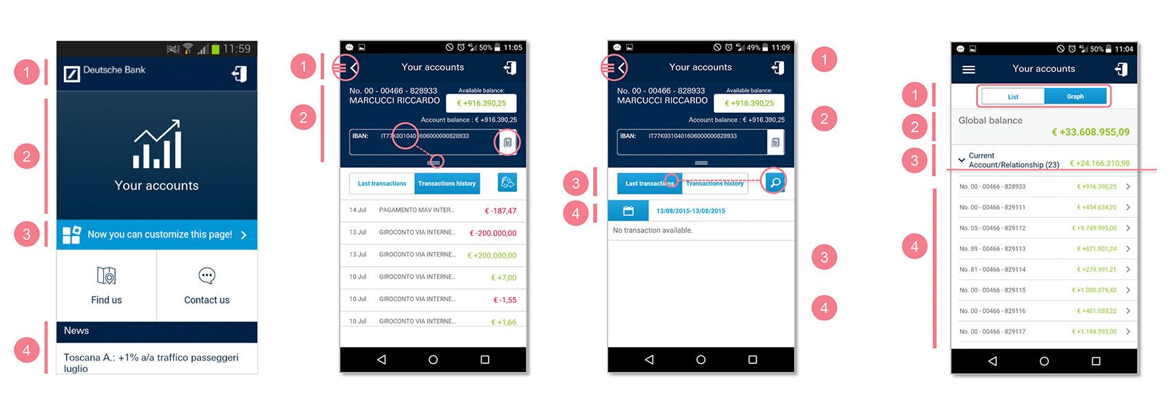
Deutsche Bank ‘MyBank’ in Italy, Spain, Belgium and Portugal faced bad and disconnected user experience remarks in app stores (iOS/Android).
Disclaimer: To comply with my non-disclosure agreement, I have omitted and obfuscated confidential information in this case study. All information in this case study is my own and does not necessarily reflect the views of Deutsche Bank
High level goals:
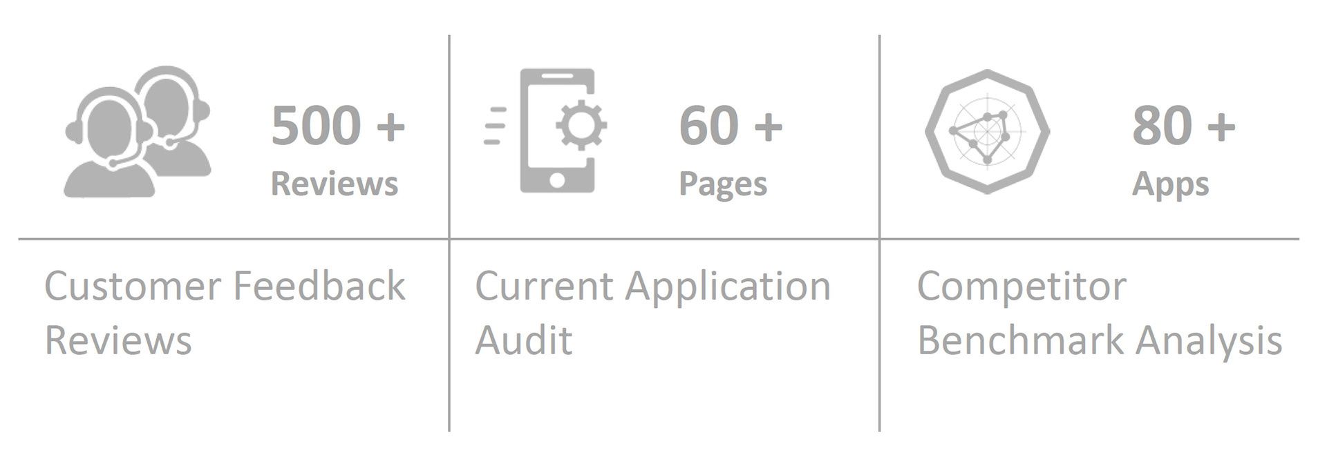
- Review of key findings and opportunity areas (Customer Feedback Reviews, Heuristic audit and Benchmark)
- To jointly ideate, sketch and develop new concepts to improve user experience
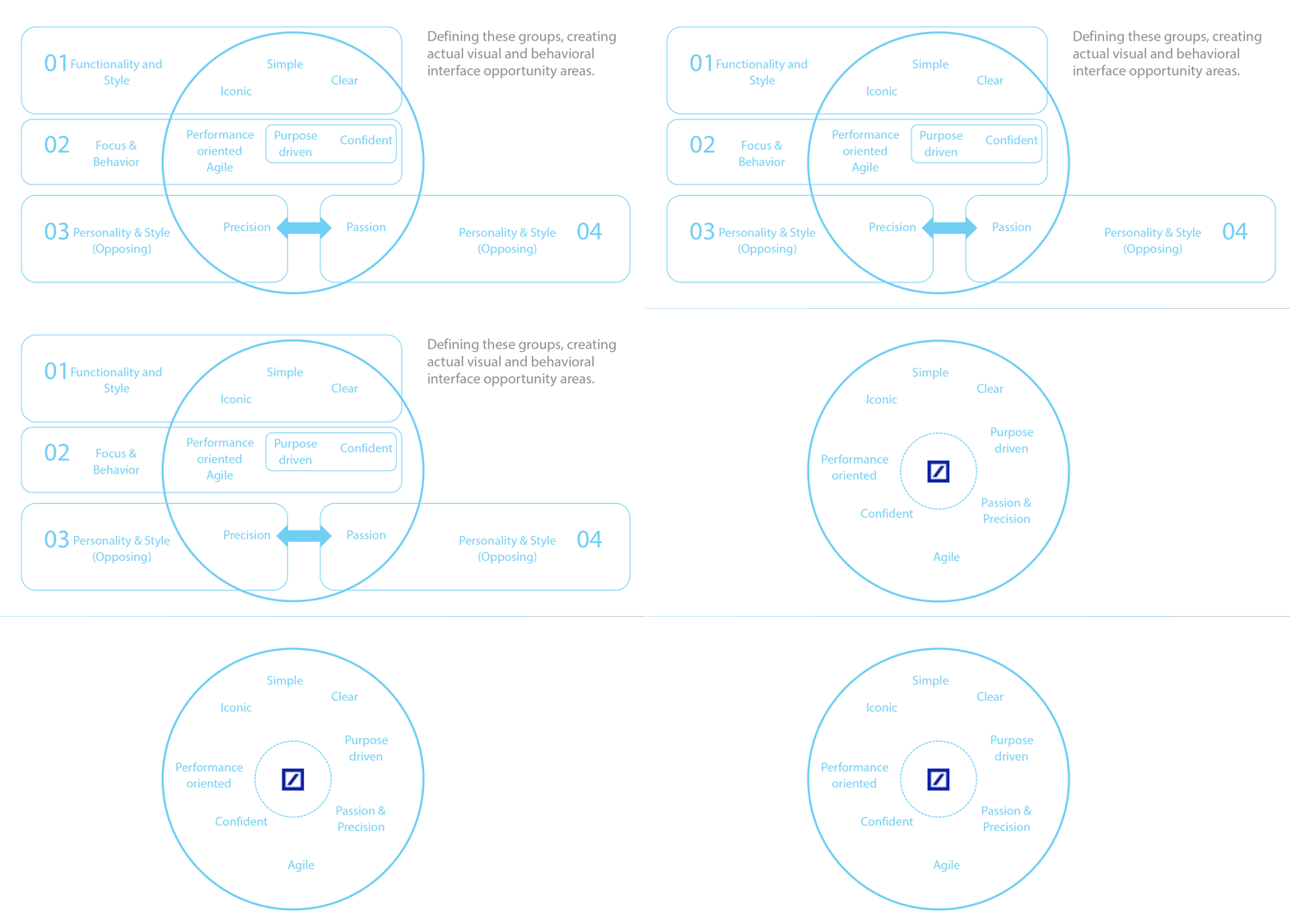
- Bring Deutsche Bank brand translation in redesigned new MyBank app
My Role
As design lead was responsible for the 4 week design thinking workshop at Deutsche Bank Milan, Italy in late 2015. Coordinated with 2 design managers and 4 product owners from different countries in Europe. Daily design activities include jointly ideating, sketching wireframes & concepts and presenting the design solutions in different pain areas of existing banking app. Also steer and moderate the workshop during design thinking and mockup sessions towards amicable solutions considering mix of people from different culture and in deed the time.
Design Process
Information Architecture
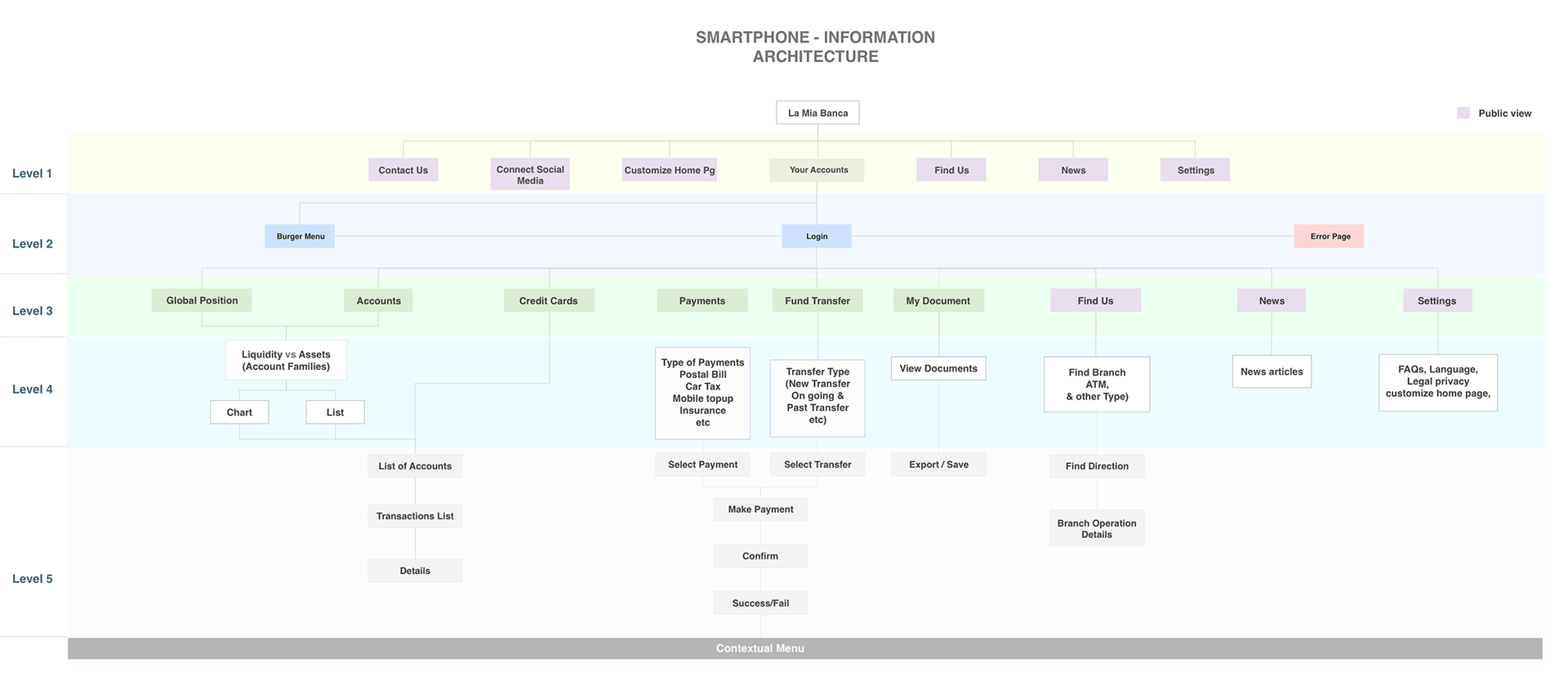
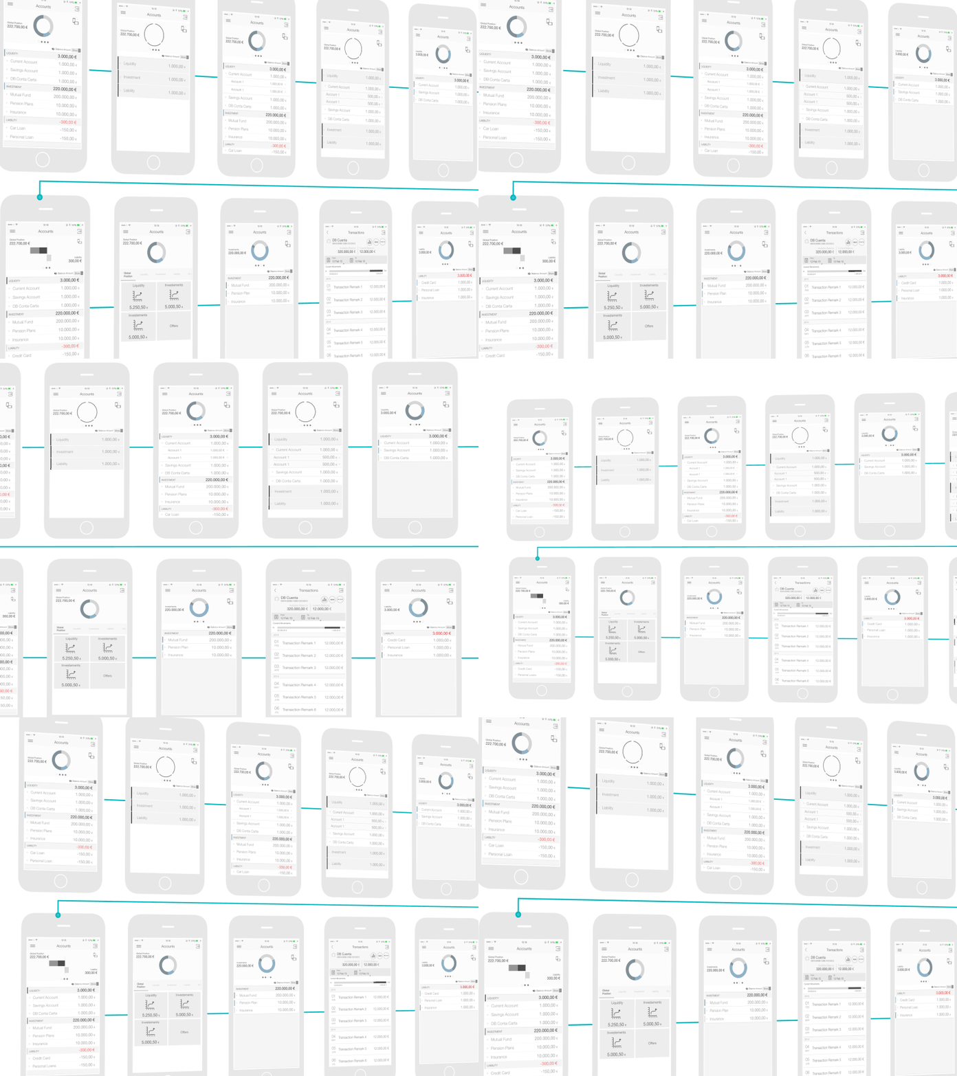
Redesigning the whole app was not feasible in limited time. To begin with it was important to identify the key areas of improvement with IA and user flow of existing app as a good start.
Wireframes
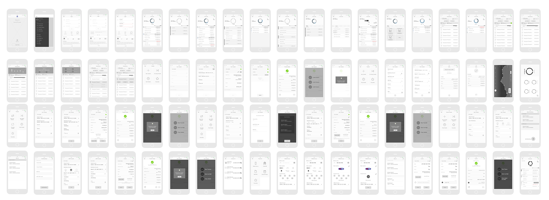
Once the key features are identified, ideas were translated to meaningful wireframes
Existing app pain areas
Brand Translation
Design Exploration
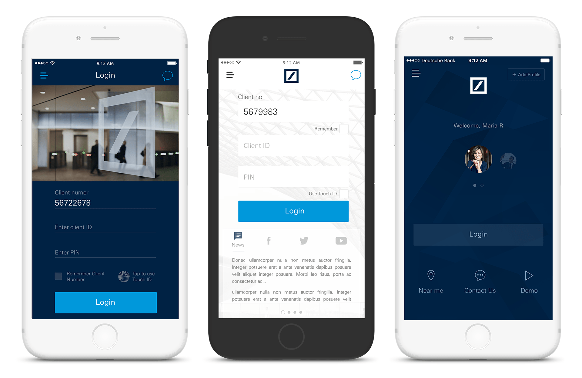
Design Inclination - Dark theme
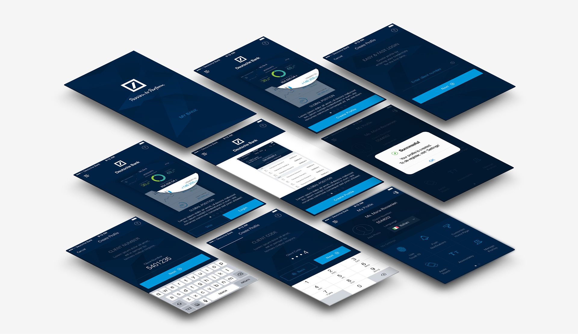
Onboarding New User / Registration Flow
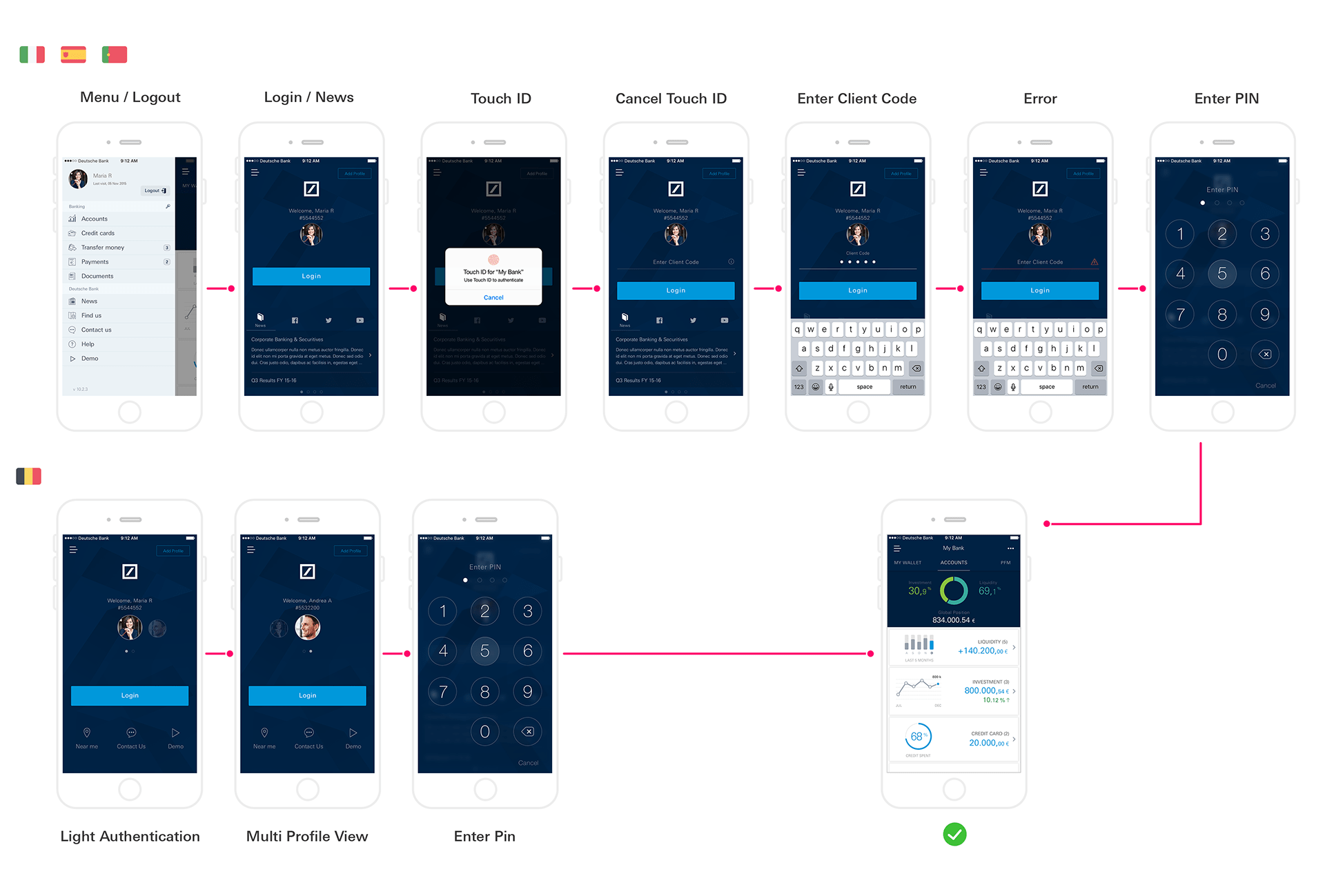
UX Flow - Login Process
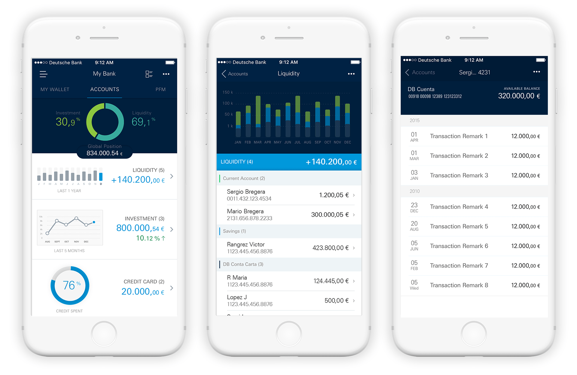
Overview / Global Position
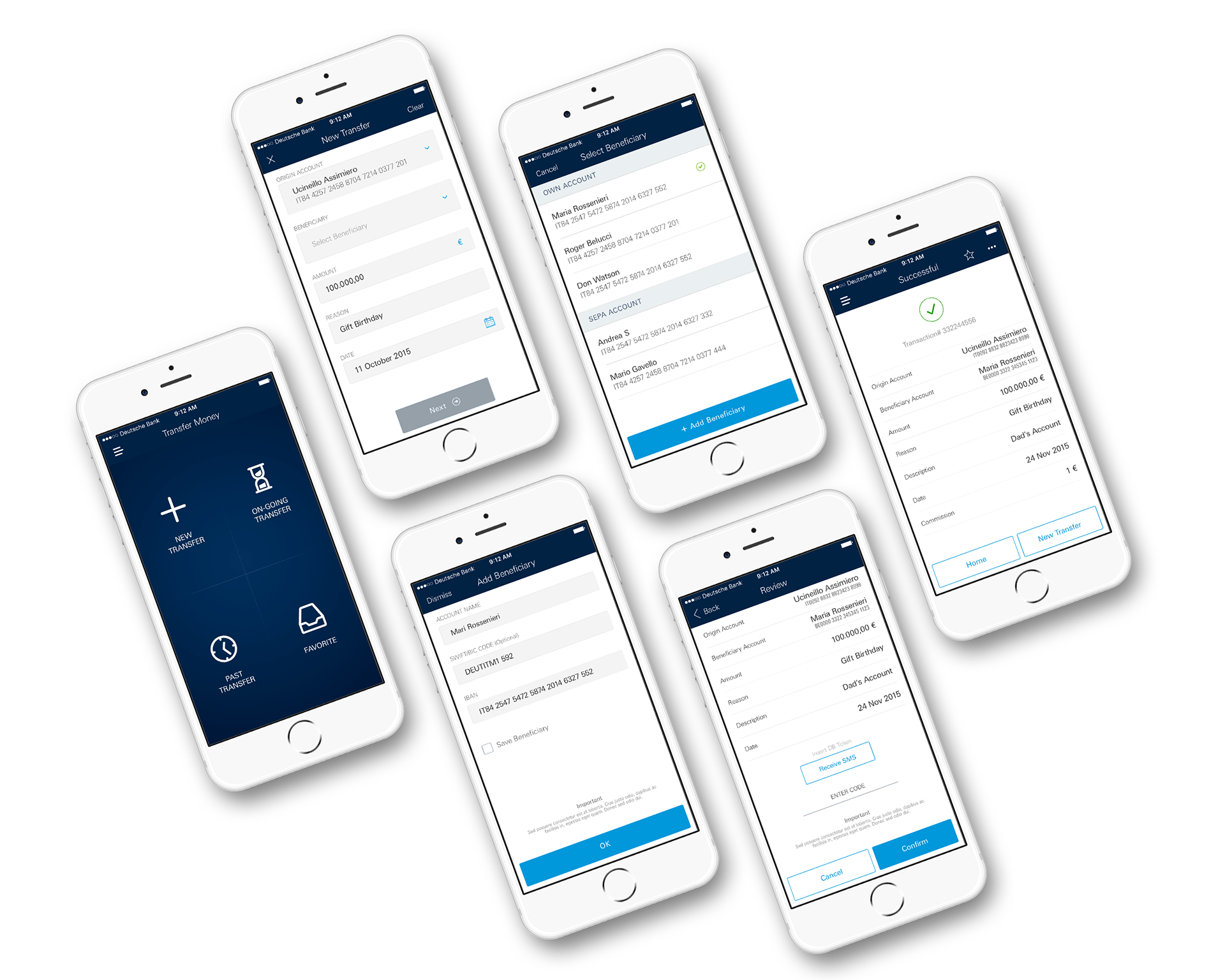
Transaction - User Flow
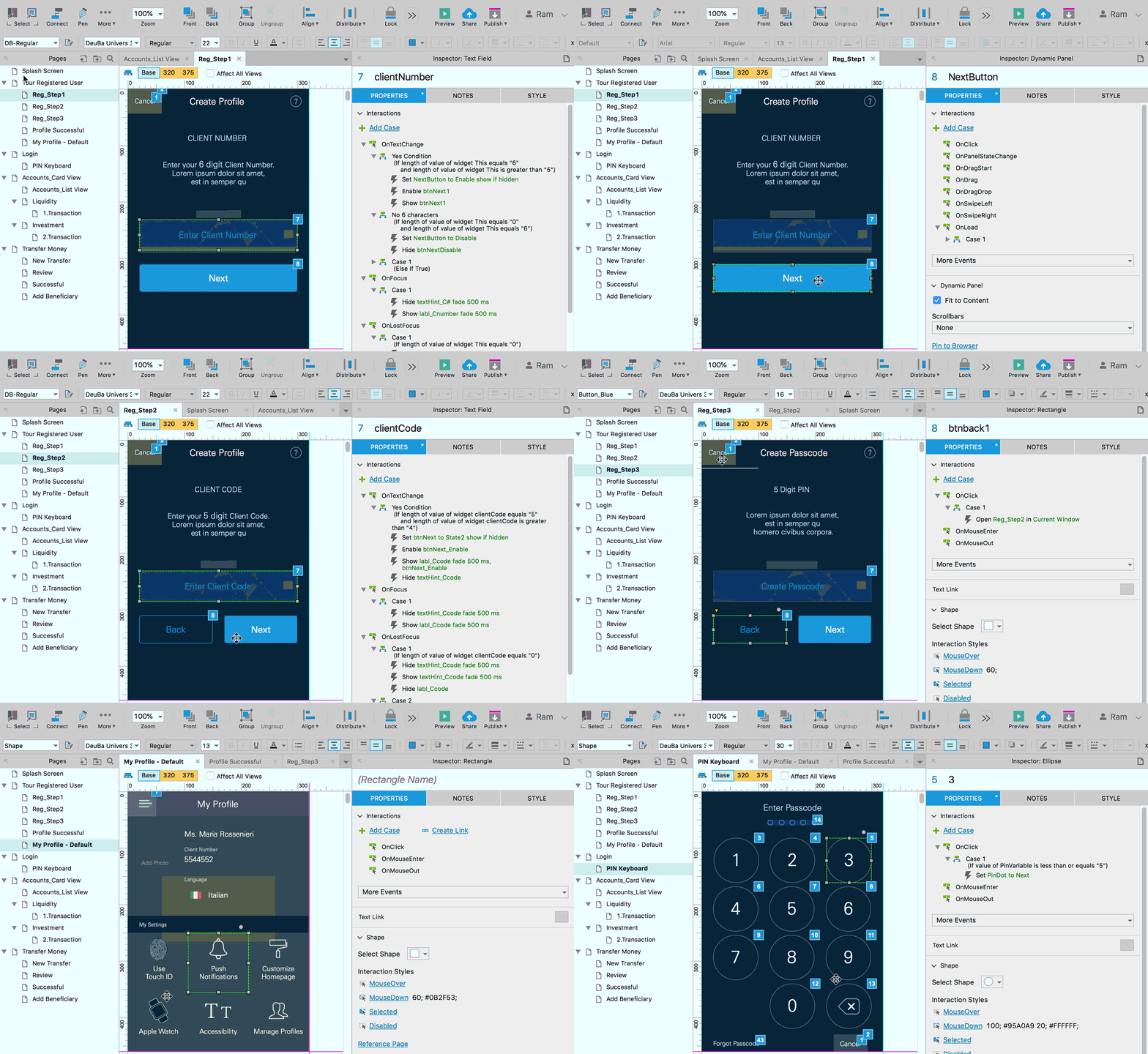
Design to Prototype - Build

Key Learnings
With mix of different country product owners each having a different problem statement, arriving at common design solutions was never easy. Eventually few countries decided to go with custom UX flow. High-fidelity wireframes with detailed user flow were needed even at initial design phase, that delayed the workshop schedule. Design feedback sessions with individual POs helped. Due to limitation in legacy system APIs, not all design solutions could be translated to simplified UX flow.
